Thinking In Boxes
One of the hardest things to comprehend when learning htlm and css is the transition between code and physical spacing. That is, how do a bunch of tags become a well designed website?
How does this happen?
It can be very difficult at first to conceptualize how a vertical sequential cascading style can be actually made into something like the google homepage. The key to doing this, is to learn to think in boxes.
Everything in html is built around a box, or if you prefer. a frame. Lets look at the google homepage for a moment. If you look at it broadly, it can be broken into three or four groupings, which in reality are boxes. You can easily verify what's grouped together in the google homepage, by simply going to it in your browser and zooming out. You'll notice there are certain areas which "cluster" together.
There is actually a fifth box to consider, the page itself, you should always remember that the page itself can be a defined frame for you to move things around in.
Knowing this, it is suddenly very easy to start figuring out what to code. For example, you might start with the upper right navigation bar. Now that you know that it's a box, you can code the things inside the box, style them, and then and only then worry about properly placing them. Since you know you need a box to place them in, you might define the whole page as a box with "width: 100%;" on your css, so that your main "box" adjusts to fit the size of the viewers screen. Then you can get to the nitty gritty of actually locating your box within the bigger box of the page, perhaps by floating it right.
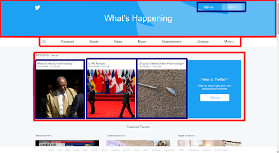
Lets look at another example. We'll go to twitter for this one. If you happen to be already logged on to twitter, I highly suggest visiting it in incognito mode on chrome so you get a chance to see what it looks like before we break it down into boxes.
It should be relatively easy to see here that we have boxes, and then boxes within boxes.
These are the outside boxes, a top login/logo container, with buttons, a navbar, and then a highlights section. From a UX point of view, it's quite elegant. As a beginner to html, it might give you conniptions however. The nav bar itself is fairly easy, but what about the login buttons on the "What's happening" section? Or the stuff in the moments box?
If we remember that we can place boxes within boxes, then it becomes a lot simpler.
Suddenly the moments section doesn't seem so difficult. We just need a heading, a subheading an image (which we need to remember to limit in size), and then we can place all that within a "moments" frame. If we make our individual moment boxes inline objects, and are careful with our spacing, it'll all stack neatly. By thinking of the individual moments as boxes, and then just treating them as single entities when they were done, we made a seemingly difficult task, into a relatively trivial one.
So, to recap, when you're trying to think in html, your first and most important step is to break down everything into boxes. If you need to make a mockup for a website, it can be as easy as opening your image editor of choice, and throwing up boxes to figure out your layout.
In particularly complex layouts you might wind up within boxes within boxes within boxes ad nauseam, but as long as you break the page down into its individual boxes, you should always be able to position things the way you want to.


